Background
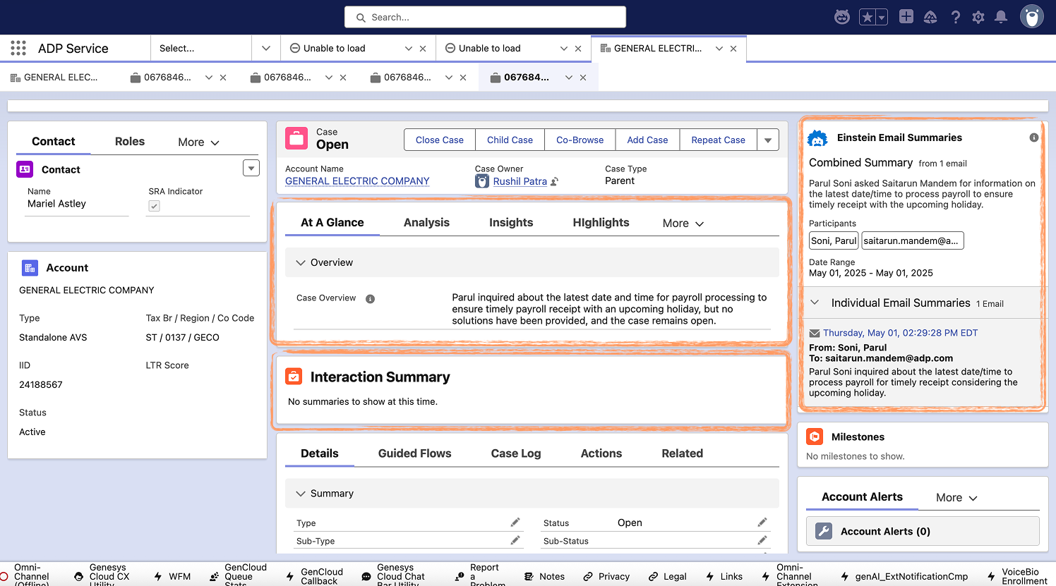
Resolving client issues at ADP often spans multiple teams and communication channels — including chats, calls, emails, and internal notes. While voice and chat summaries existed, email threads and case history were scattered across different areas of the interface. This fragmentation forced Client Service Representatives (CSRs) to manually reconstruct case timelines, leading to inefficiencies, slower resolution times, and inconsistent client experiences.
My Role
As the Lead UX Designer, I was asked to recommend the placement of two new components — the Case Summary and Email Summary — on the existing Case page. After reviewing the developer’s initial concepts, I identified broader UX issues and provided holistic recommendations that aligned with real-world workflows and user needs.
- Tools: Whiteboarding, Sketching, Figma
- Deliverable: Userflow, Wireframes
The Problem
Context
Resolving client issues at ADP often requires collaboration across multiple teams and communication channels — voice calls, chats, emails, and internal case notes. These interactions span not only our clients but also various internal personas like Tier 1 and Tier 2 associates.
While voice and chat summaries are currently available in the Service Zone, email conversations and case history remain fragmented and difficult to navigate. Key information is scattered across different sections of the case page, forcing Client Service Representatives (CSRs) to manually search, interpret, and reconstruct a timeline of events.
This results in a disjointed experience — slower case resolutions, miscommunication between teams, and inefficiencies that impact both CSRs and clients alike.
To address this, we need a streamlined solution that aggregates and summarizes all interaction types — voice, chat, email, and internal case activities — into a single, concise, and accessible view.

Key Problems Observed With the Initial Implementation
Understanding the User Flow
I began by mapping a detailed user flow to illustrate how a consolidated summary could improve efficiency — particularly in cases involving escalations, handoffs, and cross-channel communication (e.g., chat to email). This helped align the team around a shared understanding of the service journey.
Translate Into Scalable Design Solution
Summary Section Placement
Introduced a consistent summary location on the Case page. Even when empty during early engagements, its static position builds user familiarity and trust.
Tabbed Summary Card
Designed a modular summary component with four tabs:
Outcomes
Moving the Needle
The design proposal was presented to and well-received by the Emerging Solutions Team. While implementation status is pending, the design elevated the conversation from feature placement to holistic service experience — encouraging cross-functional thinking about how summaries support both CSRs and clients.
Reflection
This project reinforced my belief that service design in UX is about the entire journey, not just screens. By zooming out to consider every touchpoint — across channels, roles, and time — we create solutions that truly serve both the user and the business.