Background
This is a one day brainstorm exercise within our B2B design team at Verizon. Each person took a problem he/she wanted to tackle: Where and how would you improve the Verizon My Business portal such that it is more feasible to both small business and large enterprise customers? I decided to work on shipping address selection on eCommerce Lower Funnel.
- Tools: Whiteboarding, Sketching, Photoshop
The Problem
Like the typical eCommerce experience, when user is making a purchase, he is required to provide a shipping address. User is given the option to ship the package to a new address or select from a list of saved addresses. User may also modify or delete saved addresses if needed.
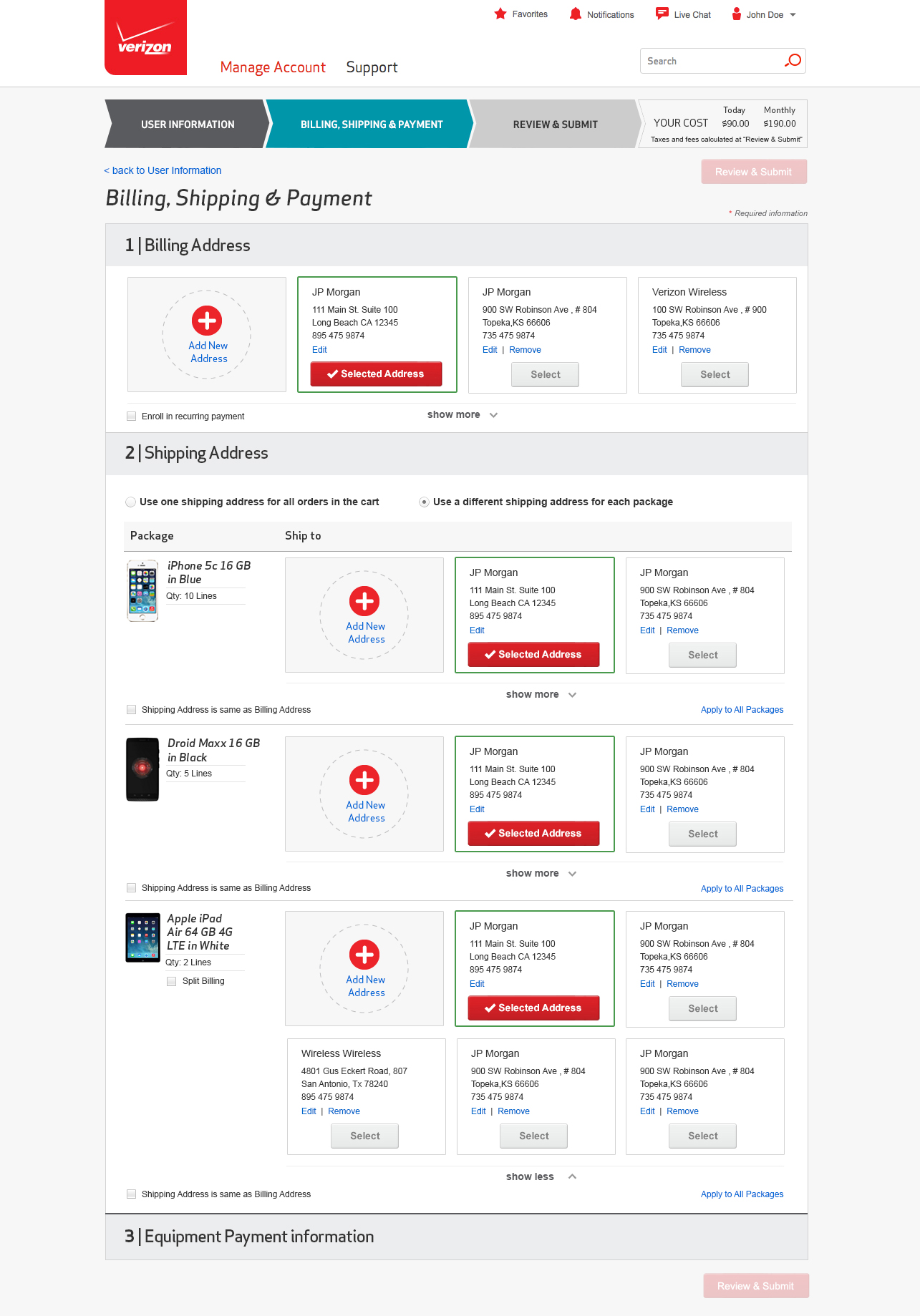
On Verizon My Business, the existing user interface uses cards to display the option to add a new address, and all the other saved shipping addresses. This design works great for small business customers with less than ten addresses; it allows the customers to easily find the addresses he’s looking for at a glance. Each card has a large button, which makes the selection easier than the traditional radio button.
However, for customers with more than a dozen saved addresses, this is not so much a pleasant experience. Address cards are view friendly when there are only 3-4 rows, but undoubtedly this design also takes a lot of real estate. And when the size of customer scaled up – imagine a larger business with 50 addresses – that is a lot of scrolling to find a saved shipping address.
In this exercise I wanted to focus on improving the address selection experience for users with more than a dozen saved addresses. Requirements include:
The Research
I first started by researching how other websites are handling shipping address selection.
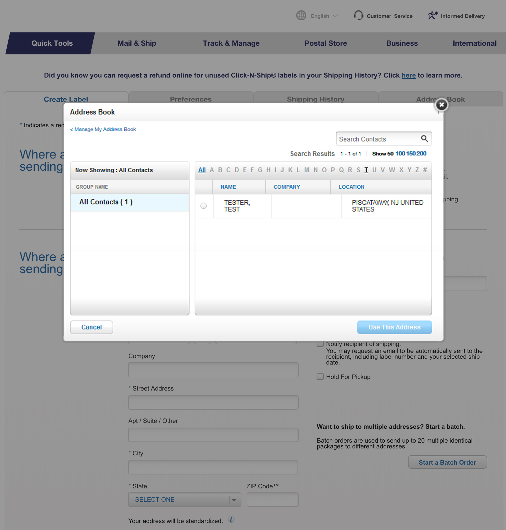
USPS
When talking about managing addresses in large scale the first example popped into my head is postal/delivery services like USPS and FedEx. When user is creating a shipping label on USPS, the default shipping address option to create a new address. User may use address book to select a saved address. On the Address Book overlay, user can search an address by contact, filter by the first letter of the recipient name, or filter by contact group if applicable. The search functionality is really powerful, but it’s more oriented around recipient’s name. There is no direct link to edit one single address. User has to go to the Manage Address Book page, then to select the address he wanted to modify.
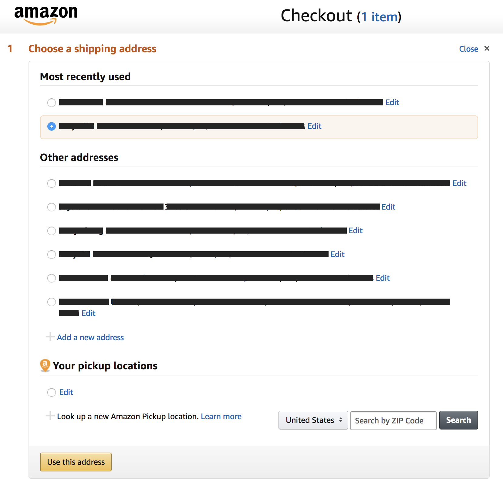
Amazon
When user first landed on the Checkout page, by default the selected shipping address is the most recently used one. User can click on the Change link to select from a list of shipping addresses. I like how Amazon separated the most recently used and other addresses. More often than not user has the tendency to use some addresses more often then the others. By separating them out it will make the address identification faster.
Solutions
I found the option to enter new address is used least often; it is taking too much real estate in a card view and I decided to have it displayed as a link. I created three mockups for possible solutions to display saved addresses.
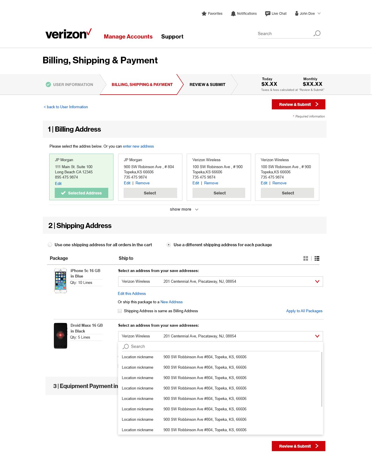
Solution 1: Dropdown
First solution is to use a dropdown list. By default the most often used address is selected. Upon expanding the dropdown list, user can select a different saved address, or use search to facilitate the process. Dropdown list takes the least amount of real estate, but it is very different from the existing address cards design.
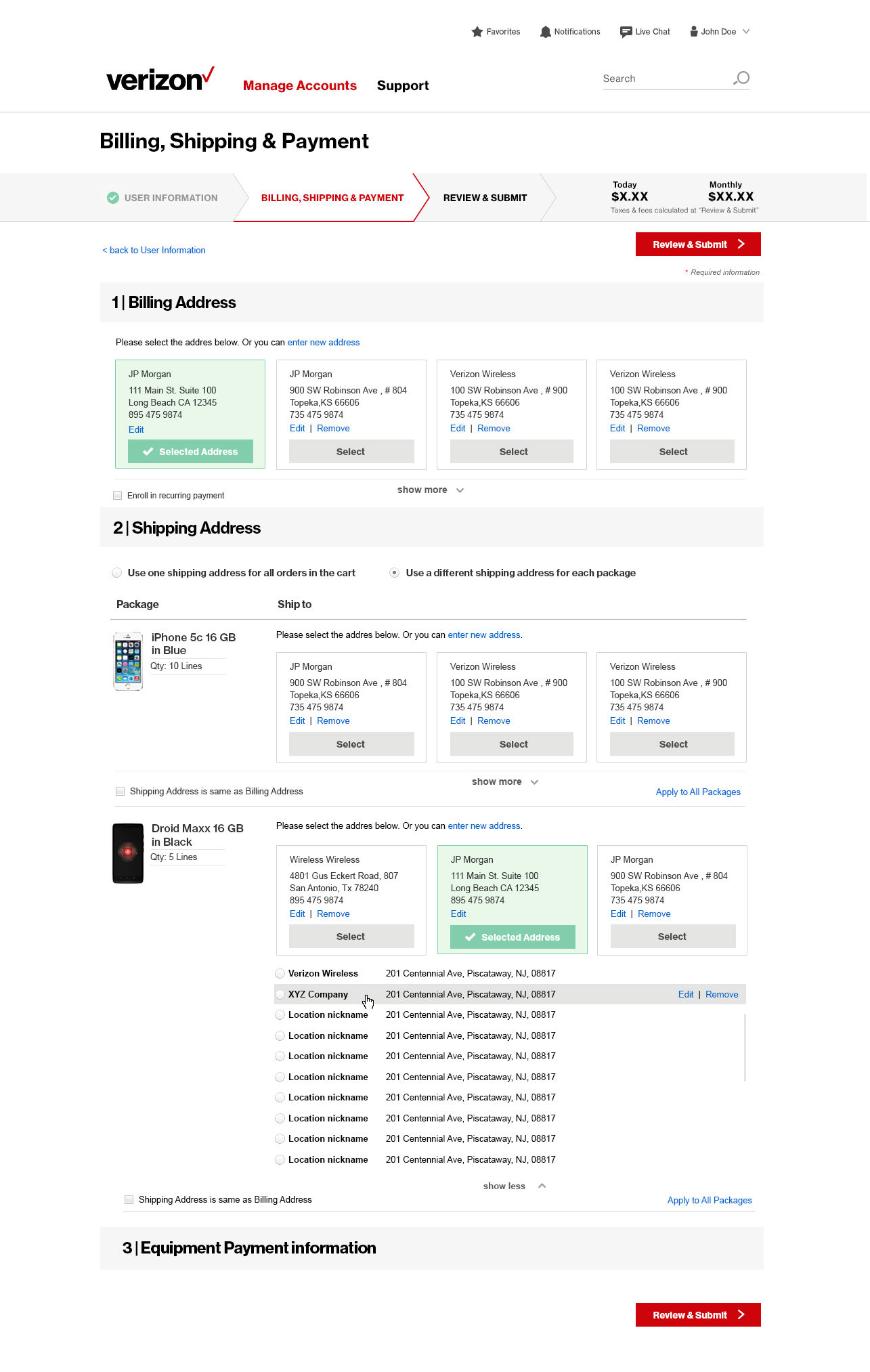
Solution 2: Radio button list
By default the most often used three addresses are displayed in cards view. User can click on Show more to see the other addresses in radio button list. Upon hovering over an address, user will see the link to edit or remove that particular address.
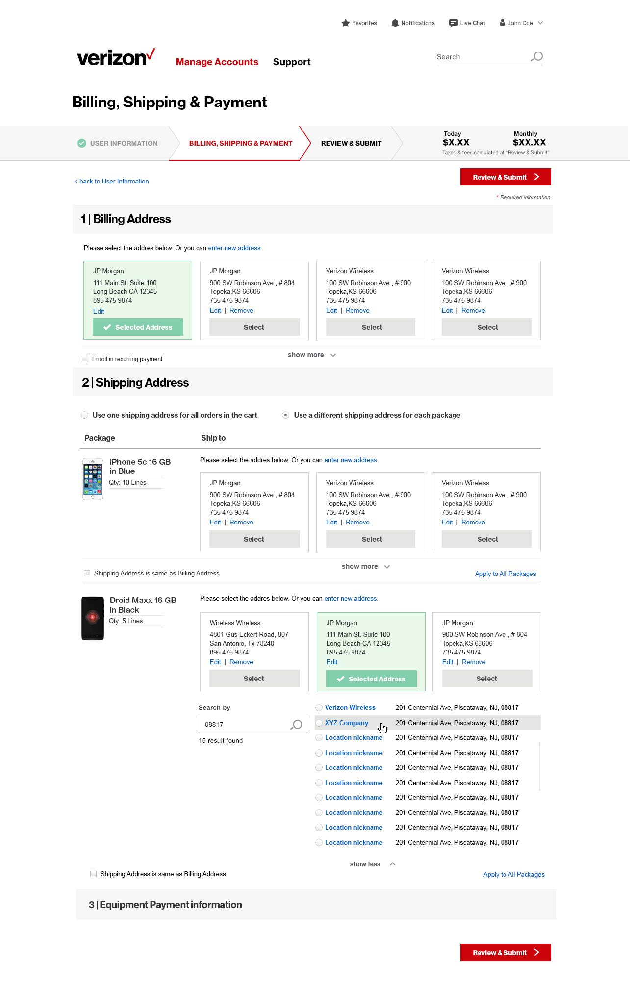
Solution 3: With search functionality
This solution is very similar to the second solution, but with the ability to search by address or zip code. User can click on the address nickname to edit or modify the address, but it is less prominent compared with the second solution.