Background
Over the course of 3 months, my UX partner and I worked with multiple stakeholders to redesign the desktop shopping experience for the Device Protection Plans on AT&T's B2B Premier website.
My Role
I collaborated with a Lead UX Designer throughout the process. I held several JAD sessions, sketched out ideas, assisted the Lead UX Designer in wireframe creation, and then I created comps that helped stakeholders to better visualize the design.
- Tools: Whiteboarding, Sketching, Visio, Photoshop
- Deliverable: Wireframes, Comps
The Problem
Device Protection is a high-marginal revenue product. In this redesign project the business stakeholders came to us with three goals:
The Discovery
We initiated the project through a series of discussion. In the early stage we held mutiple joint application design (JAD) sessions with business analyst and IT specialist to collect requirements while developing new ideas.
The Ideation
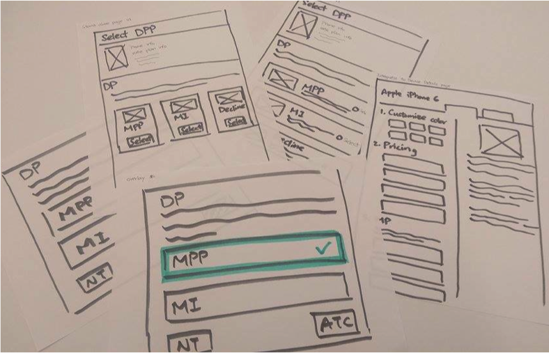
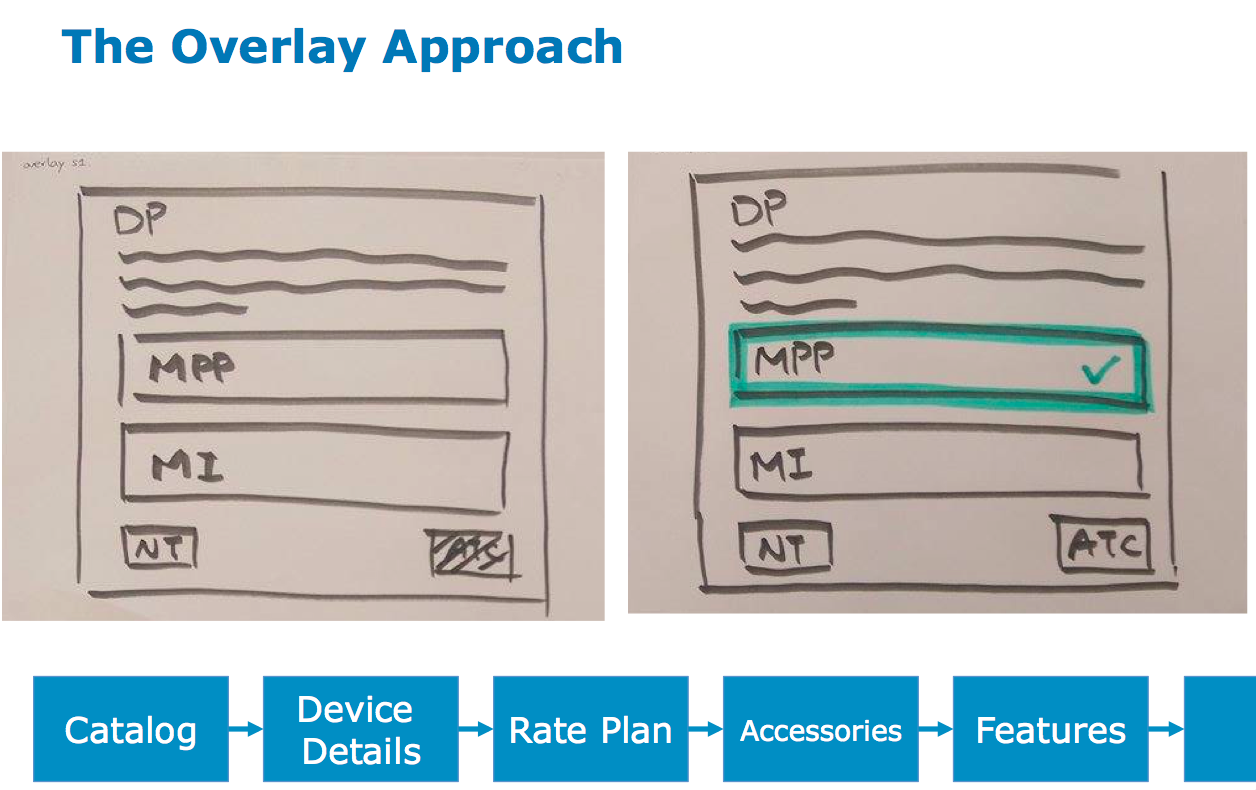
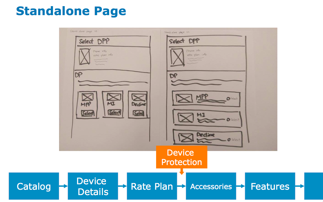
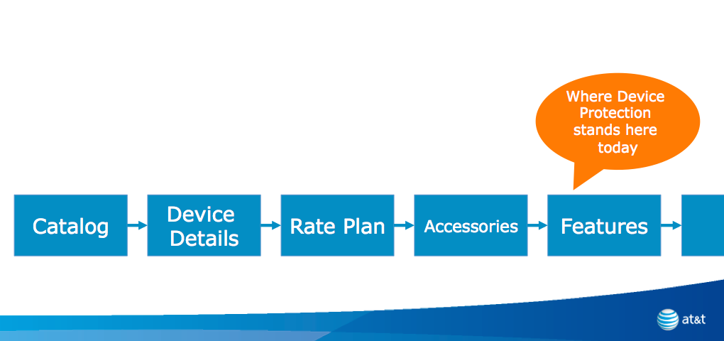
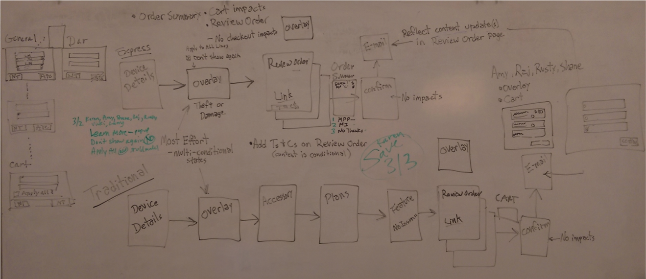
Based of the information we gathered at JAD sessions, we came up with five different solutions: overlay approach; standalone page; integrate to Device Details page; Integrate to Accessories page; and restructure Features page.
These ideas were quickly sketched out on paper and used to compare the pros and cons of each possible solutions.
After a series of discussion we opted for the standalone page approach. Since the page is dedicated only to the Mobile Protection products, there is enough space for user to learn more about them and make the decision. Furthermore, this solution is also more scalable and it allows the business to add more insurance plans in the future. Last but not least, this approach would allow us to conduct A/B Testing and place the page anywhere in the buy flow.
Siteflow and Wireframe
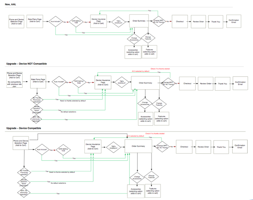
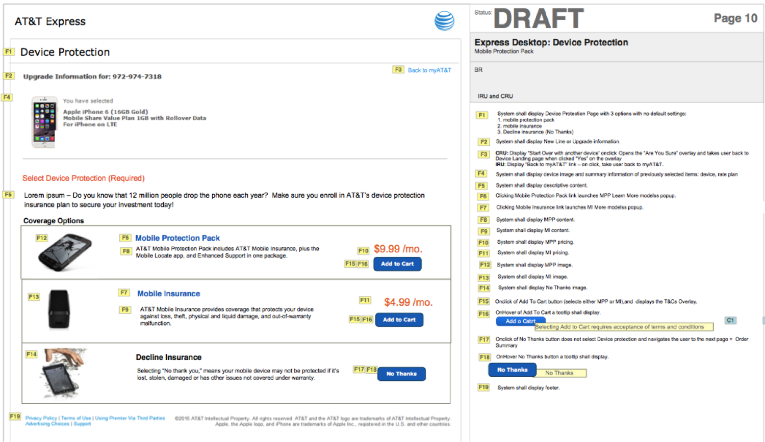
Upon agreement on standalone page approach, we quickly moved on to create siteflow and wireframe. Designs were created for various scenarios, including purchasing new device, add a new line, upgrade device, and etc.
Detailed Design
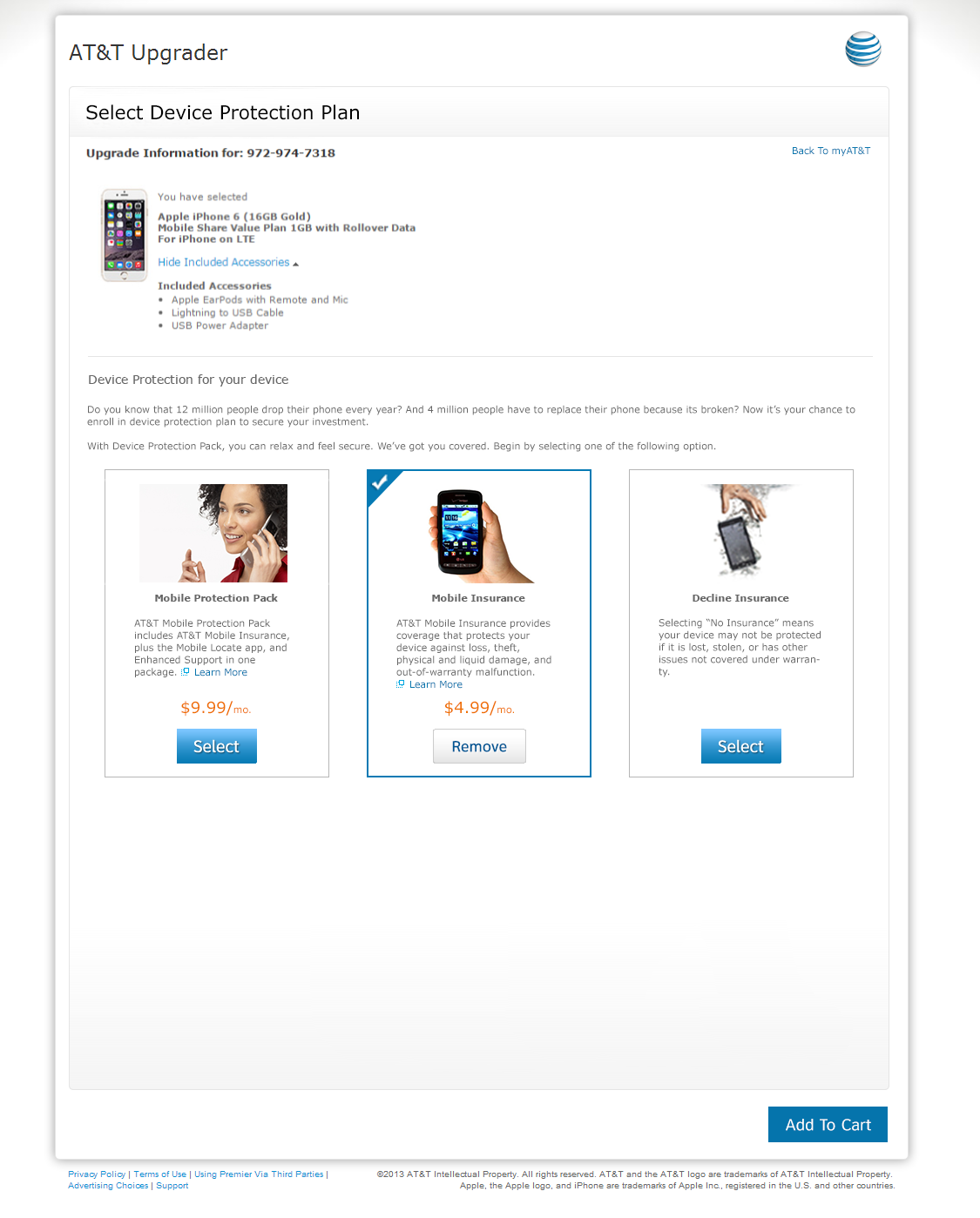
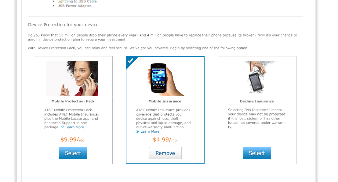
With the wireframes provided by the Lead UX Designer, I created multiple hi-fidelity designs. Through research and discussion we eventually agreed on this version of comps.