Background
Foodbus is a work lunch ordering startup aiming to bring better decent lunch to office worker. It is designed to help office workers reduce the effort of getting a decent work lunch.
My Role
I was part of the pitch team and I was responsible for concept definition and UX design. I lead the UX work, including research, information architecture, interaction design and UI design.
- Tools: Research Interview, Sketches, Lo-Fi Prototyping, Persona, Adobe Illustrator, HTML5, CSS3, Less, C#
- Deliverable: User journey, Lo-Fi Prototype, HTML Prototype
The Problem
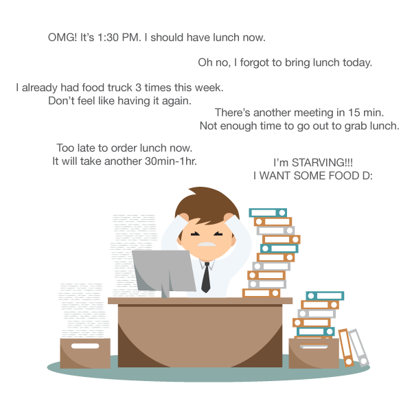
Office workers in central business area usually have few choices for lunch. People either have to bring their own lunch, go to the nearby restaurants/food trucks, or drive to further areas to grab a bite. All of these three cases are time consuming.
One other option is to call restaurants or make order online through food ordering websites like Eat24 and GrubHub, but very often there is a requirement on minimum purchase and the wait can range from 30 minutes to one hour.
The Approach
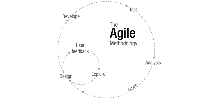
As a startup Foodbus adopts agile methodology. We set multiple small goals and followed two weeks project life cycle. This method helped us produce some deliverables by each deadline. Within each two-week period, I would create design deliverables that would be used for development in the next sprint.
Scrum meetings were also held twice a week to reflect each team member's goals and accomplishments, and to eliminate any obstacles in the path of completion.
The Discovery
The original idea for this project was a website to help office workers enjoy a hot, decent lunch. We conducted an interview research to confirm the existence of problem and the absence of solution. A brief competitor analysis was also conducted to help us understand the existing market.
Findings
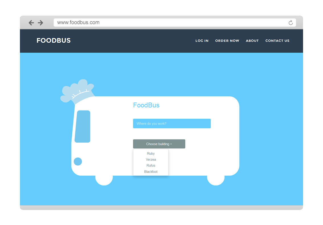
Based on our research findings and company strategy, we have set our target user to be Asian office workers in Seattle Downtown Area. We quickly sketched out the initial idea then created a quick mockup using Bootstrap.
Ideation and Information Architecture
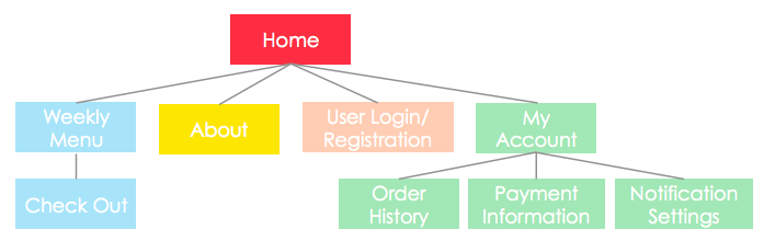
In creating the structure of the new website, I collaborated with the software developer and front-end developer. After discussing typical user tasks with them, I created multiple potential sitemaps.
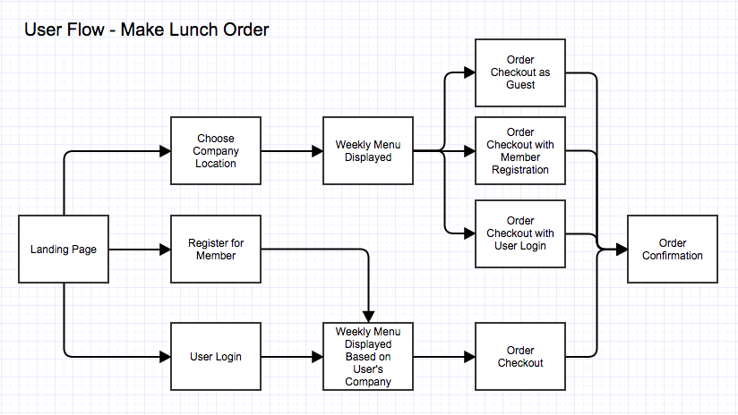
Based on the sitemap approved, I created some basic user flow diagrams as reference for the office staff and counselors.
The Pitch
With our research and quick mockup, our team have a good understanding of our target users group and basic marketing approach. To gain awareness on Foodbus and to network with other entrepreneurs, we had presented our idea on Seattle Entrepreneurship Club.
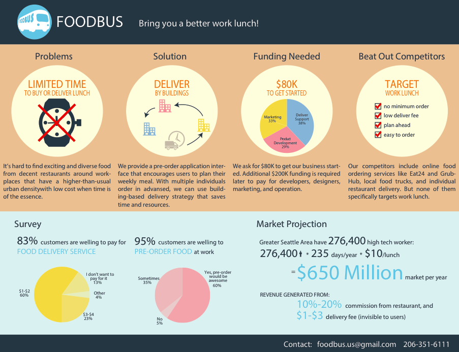
In order to help the judges to learn better about Foodbus and its business model, I created an infographic with Illustrator. I used graphic icons and short paragraphs to clearly explain the existing problem, Foodbus's solution, and funding needs.
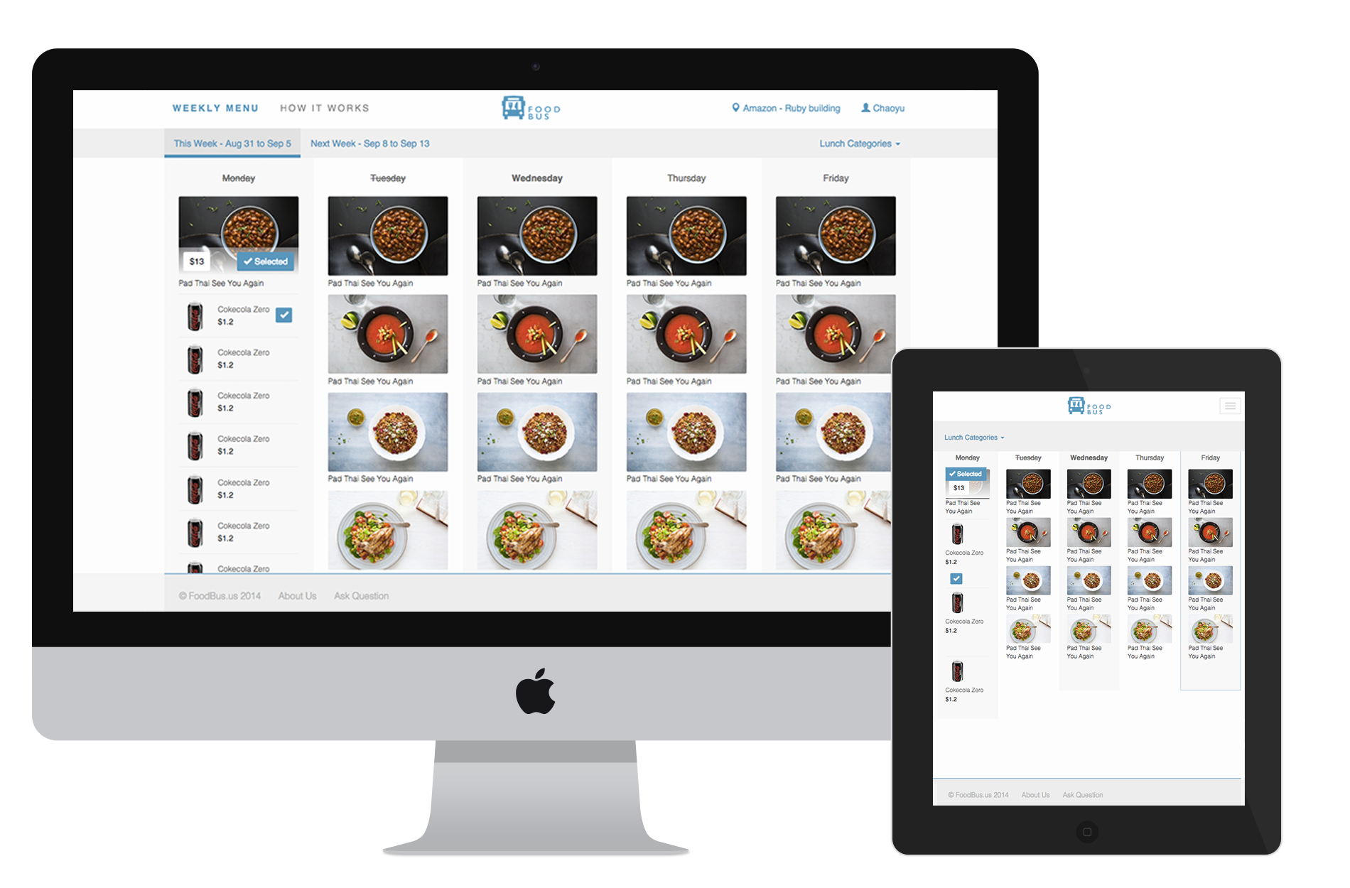
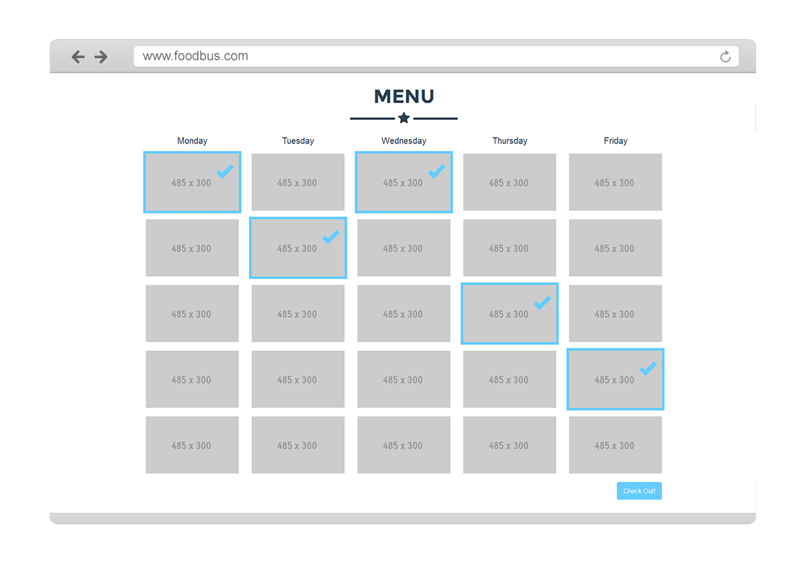
Detailed design
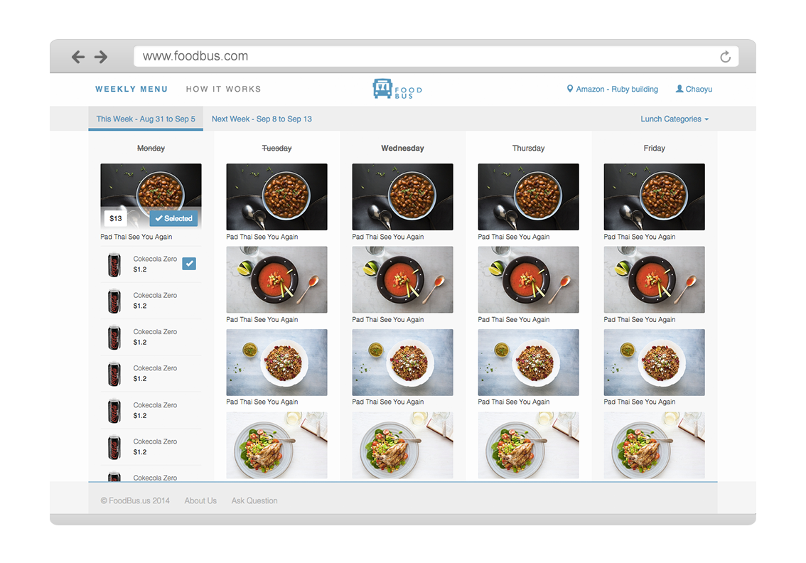
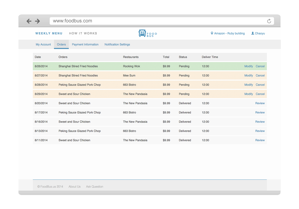
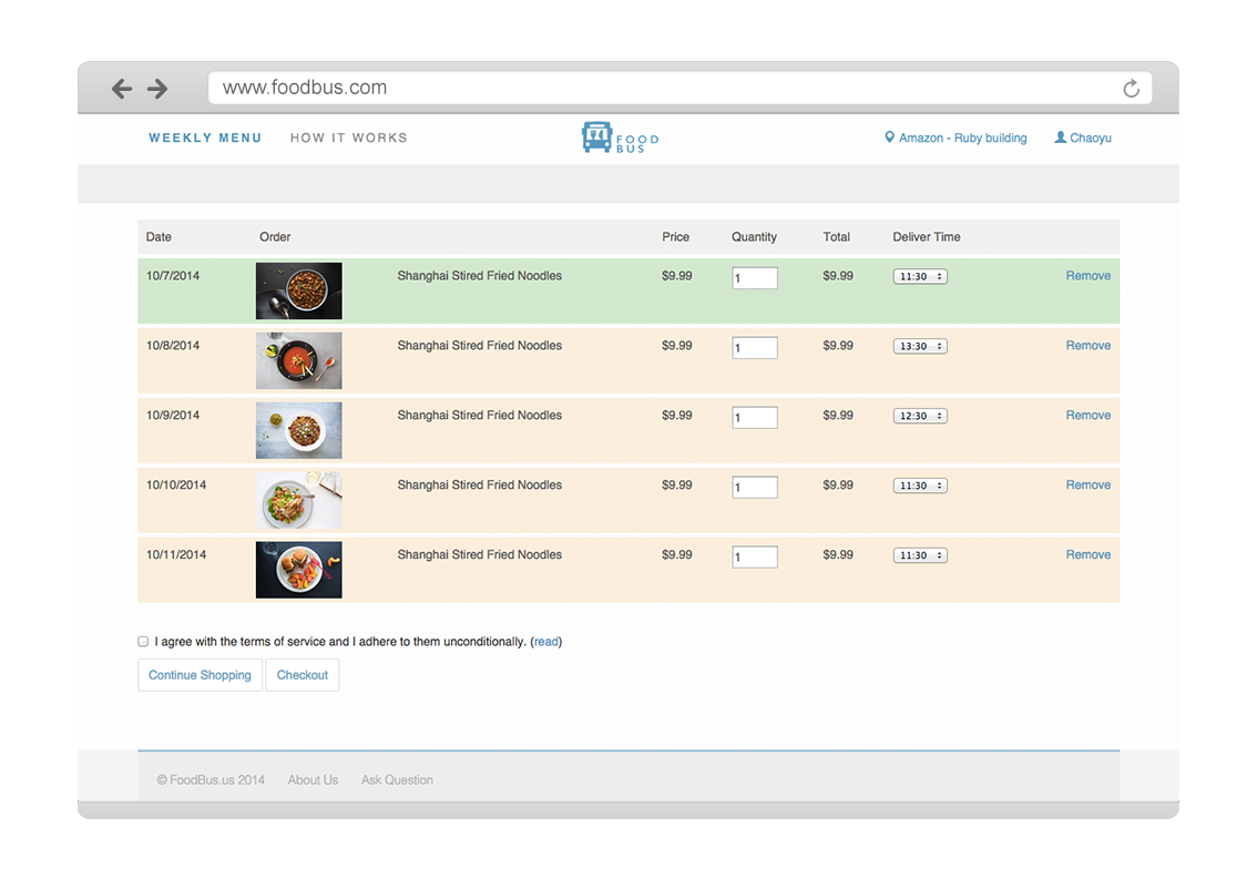
The gallery below shows the final design for order flow.